The quote from Robert Ivy, Editor in Chief of Architectural Record, describing the Shaw Center for the Arts in Baton Rouge, Louisiana, says “a glowing modernist structure sheathed in a channel glass and stainless steel exostructure” that brings the arts to everyone. That quote became my guiding idea for the grand opening poster and social graphics: let the architecture lead, and make everyone feel welcome.
Starting With Research
I started this project like I do all projects: with background research. I discovered that the Shaw Center for the Arts is a real organization, so I used the browser developer tools to inspect their website. I found that they use Futura and Proxima Nova, along with a navy and yellow color palette. To maintain brand consistency, I brought those choices into my project and replicated their stacked logo.
Inspiration from London
I spent the past 10 days in London, presenting a paper I co-authored at the ACM Hypertext conference. While there, I also had a chance to visit several museums and cultural arts centers. With this project in mind, I noticed that their visuals often matched the architecture of the spaces themselves. Elegant, detailed buildings carried elegant, detailed graphics. Heavy, industrial buildings carried heavy, industrial graphics. You get the idea.
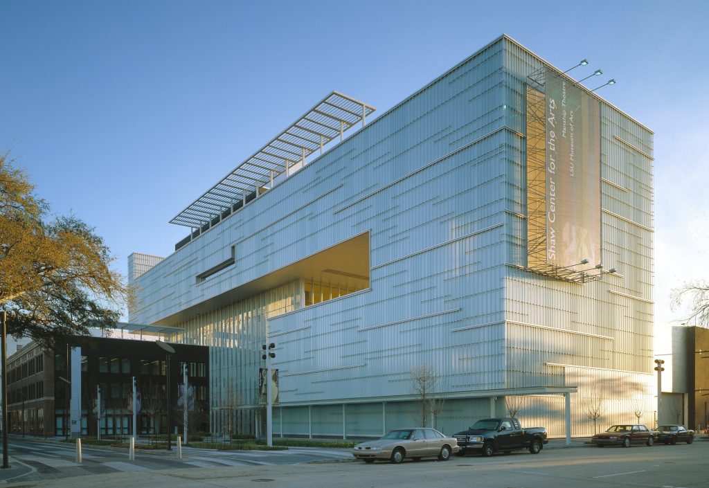
The Shaw Center is clean, sharp, and modern, and its design has earned national awards and recognition for its architecture. Given that, I leaned into clean typography, sharp alignment, and a strong focus on the building itself. I chose photos that felt cohesive with those modern sensibilities, but also complimented the colors I was designing with instead of clashing with them. One image in particular became the centerpiece of the campaign for me. It shows off the building’s materials, channel glass and the stainless steel exostructure, while also bringing together both colors from the brand palette: a beautiful blue sky and the warm yellow glow of the banner. It felt like a natural fit to feature most heavily across the poster and social graphics.
Missing the Feedback Round
My trip came with a cost though. I missed the class feedback round. This was a big setback, because critique is one of the most important stages of any design project. Without outside feedback, I did the next best thing. I stepped away from my draft for a few days, then reviewed it as critically as I could, as if someone else had made it. I caught a few typos, but I also noticed that I was trying to make each thing be so different, that any visual identity in the campaign was getting lost. A Facebook post and an Instagram post should communicate the same ideas—I didn’t need to reinvent the wheel each time just for the sake of it.
Ultimately, I ended up changing:
Alignment. Some elements in the draft were close to lining up, but not quite. I cleaned up the alignment so every edge relates clearly to the grid.
Consistency across platforms. My original social graphics looked quite different from one another. I realized that a consistent visual language would reinforce the brand, so the final versions share the same title lockup, yellow decorative accent, event details, and navy gradient.
Breathing room. Some text felt cramped in its frame. Giving those elements more space made the hierarchy clearer and the layout calmer, which also better suited the building.
Proofreading. I corrected typos from the draft. I often call myself Queen of Typos when I’m designing. I tunnel vision and introduce all sorts of misspellings. I hope I caught them all 🙂
InDesign Details
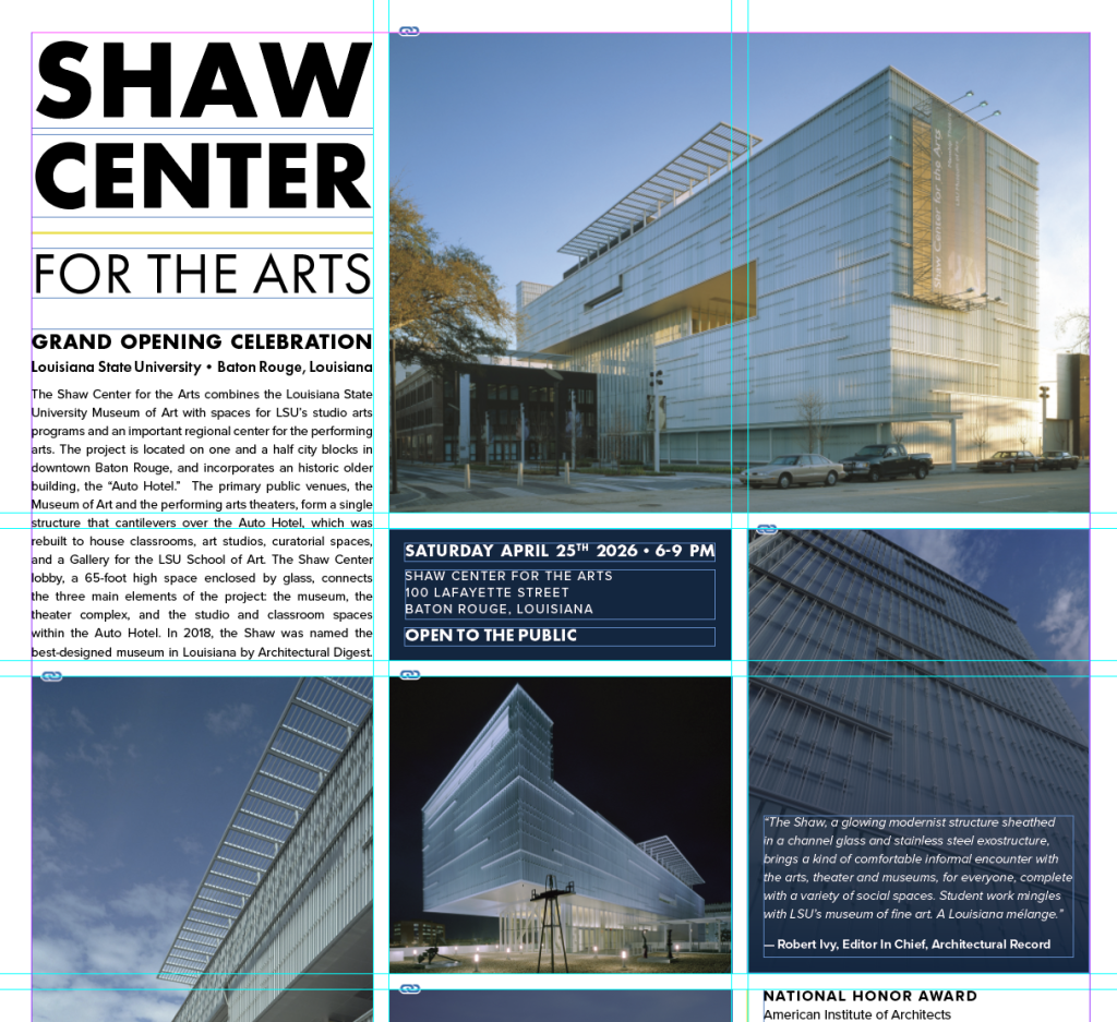
I divided the poster into three equal columns with a 0.24-inch gutter. In my web development work, we build spacing in increments of 8, so a 0.24-inch gutter felt like a natural extension of that system. The three-column grid gives the photos, body text, and awards a clear structure. I chose vertical segmentation to mirror the building’s consistent vertical lines, letting the horizontal gutters mirror the broken horizontal lines that cut across parts of the building’s exterior. The building is modular, so my design is, too.
For typography, I translated the values from Shaw’s website into InDesign. Headings are bold, all-caps Futura, and body text is Proxima Nova Regular. For the award names, I borrowed the footer’s style of all-caps Proxima Nova with added tracking to match the 2px letter spacing used online.
The Arts—For Everyone
If the arts are for everyone, the materials promoting them need to be too. I tested my color pairings for contrast using Adobe Color to make sure the text would be readable across different contexts. When text sits on top of a photograph, like in the social graphics or where I placed the quote on the poster, I added a navy gradient over the image to reduce visual noise behind the text. I also tried to not use any font size below 14pt, so it would be reliably legible to visitors with low vision. The best part about designing for accessibility though, is that it really does make things more accessible for all of us. You, me, everyone.